Florence Nightingale Diagrams of Deaths in England & Wales
July 1, 2022
This post was originally published on Trust the Evidence – written. By Tom Jefferson and Carl Heneghan
To receive updates consider becoming a subscriber.
https://trusttheevidence.substack.com/p/deaths-year-ending-2022

See ONS update: Deaths registered weekly in England and Wales
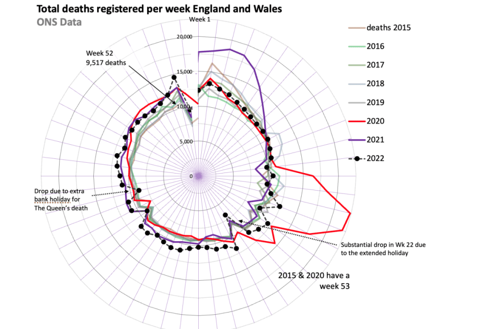
Florence Nightingale used a form of radial plots to display data from the Crimean War that demonstrated the death rate amongst soldiers could be reduced by better hygiene practices.
When time-series data is plotted as a normal x-y plot with the time variable along the x-axis it is difficult to identify seasonality or other factors that may influence the data.
Plotting the weekly numbers of deaths using this radial form demonstrates the variability during the first months of the year – For example, deaths from “Aussie flu” in the first weeks of 2018 can be observed. The increase in the number of deaths from the first week in April 2020 can clearly be seen.
Plots up to Dec 25 2020 provided by Irene M. Stratton, Senior Statistician, Gloucestershire Retinal Research Group.
Plots thereafter provided by Carl Heneghan, CEBM