Problems in identifying the origins of an outbreak
April 3, 2020
Tom Jefferson, Carl Heneghan
The most famous attempt at pinpointing the origin of an outbreak from the distribution of cases is John Snow’s iconic map of the 1854 Cholera outbreak with an epicentre in Soho.
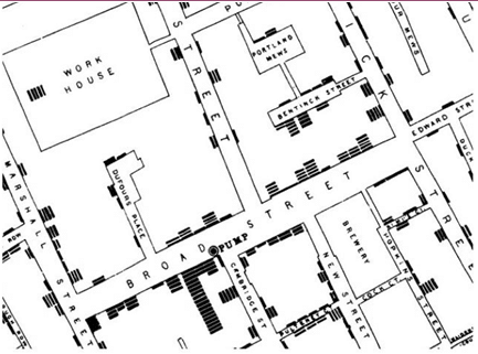
Snow’s hypothesis was that cholera was transmitted by contaminated water, drawn from a particular pump, situated in Broad Street (figure below, marked by a black dot).
This hypothesis was not in favour, as the vast majority of Snow’s contemporaries were anticontagionists, that means that they believed that communicable diseases were caused by vapours or miasmata emanating from sewage and rotting rubbish. A vestige of this theory can be found in the term malaria (archaic Italian for bad air).
By door to door enquiry and using death certificates Snow was able to reconstruct the density of deaths (each black bar stood for a death). The deaths got fewer, the further away you moved from the pump, suggesting a spatial relationship between possible exposure and outcome. The relationship is a suggestion, not proof.
The Broad Street map is a retrospective model constructed to report the results of the testing of a hypothesis (the possible link between dirty water from the Broad Street pump and deaths by cholera).
The figure is a very simple mathematical model with stark graphic clarity. The point here is that Snow’s was just a hypothesis. At its root lay uncertainty, followed by observations and then empirical testing. No oracle-like statements can be found in Snow’s two versions of his work and subsequent applications of his hypothesis.
Snow was obsessive and thorough. He understood he was dealing with much uncertainty. He also understood that an agent and a target population on their own are not sufficient to explain the origins and complex spread of an epidemic, a topic we will discuss in later posts.
A modern-day equivalent of a very grand scale of a retrospective model is that of the much-debated 009 influenza H1N1 pandemic. Widely predicted by soothsayers to originate from Asia in 2005, it materialised in 2009 in Central America. To this day the reasons for this location are not understood, despite the marvels of modern technology. Nor is it understood why, after an explosive start, it fizzled out after a few months to become a milder form of seasonal influenza. There are still – many – uncertainties.
Figure. “Map of the topography of the outbreak” around Golden Square London in August 1854.

John Snow. On the Mode of Communications of Cholera. Second Edition. London, Churchill, 1855
 Tom Jefferson is an Epidemiologist.
Disclosure statement is here

Carl Heneghan is Professor of Evidence-Based Medicine, Director of the Centre for Evidence-Based Medicine and Director of Studies for the Evidence-Based Health Care Programme. (Full bio and disclosure statement here)
Disclaimer: the article has not been peer-reviewed and the sources cited should be checked. The views expressed in this commentary represent the views of the authors and not necessarily those of the host institution, the NHS, the NIHR, or the Department of Health and Social Care. The views are not a substitute for professional medical advice.

